The New York Philharmonic has a public dataset containing metadata for their entire performance history. I recently discovered this, and of course downloaded it and started to geek out over it. (On what was supposed to be a day off, of course!) I only explored the data for a few hours, but was able to find some really interesting things. I’m sharing them here, along with the code I used to do them (in R, using TidyVerse tools), so you can reproduce them, or dive further into other questions. (If you just want to see the results, feel free to skip over the code and just check out the visualizations and discussion below.)
All scripts, extracted data, and visualizations in this blog post can also be found in the GitHub repository for this project.
Downloading the data
First, here are the R libraries that I use in the code that follows. If you’re going to run the code, you’ll need these libraries.
library(jsonlite)
library(tidyverse)
library(tidytext)
library(stringr)
library(scales)
library(tidyjson)
library(purrr)
library(lubridate)
library(broom)
To load the NYPhil performance data into R, you can download it from GitHub and load it locally, or just load it directly into R from GitHub. (I chose the latter.)
nyp <- fromJSON('https://raw.githubusercontent.com/nyphilarchive/PerformanceHistory/master/Programs/json/complete.json')
Now their entire performance history is in a data frame called nyp!
Tidying the data
The performance history is organized in a hierarchical format ― more-or-less lists of lists of lists. (See the README file on GitHub for an explanation.) It’s an intuitive way to organize the data, but it makes it difficult to do exploratory data analysis. So I spent more time than I care to admit unpacking the hierarchical structure into a flat, two-dimensional “tidy” structure, where each row is an observation (in this case, a piece of music that appears on a particular program) and each column is a variable or measurement (in this case, things like title, composer, date of program, performance season, conductor, soloist(s), performance venue, etc.).
Getting from the hierarchical structure to a tidy data frame was something of a challenge. There are a number of different kinds of lists embedded in the JSON structure, not all of which I wanted to worry about. So I poked around for a while and then created some functions to extract the info I wanted and assign a single row to each piece on a particular program, which would include all of the pertinent details. Here are the custom functions for expanding the list of metadata for a musical work, and then reproducing the general program information for each work on that program. (Note that I left the soloist field included, but still as a list. I’m not planning on using it, but I left it in for future possibilities.)
work_to_data_frame <- function(work) {
  workID <- work['ID']
  composer <- work['composerName']
  title <- work['workTitle']
  movement <- work['movement']
  conductor <- work['conductorName']
  soloist <- work['soloists']
  return(c(workID = workID,
           composer = composer,
           title = title,
           movement = movement,
           conductor = conductor,
           soloist = soloist))
}

expand_works <- function(record) {
  if (is_empty(record)) {
    works_db <- as.data.frame(cbind(workID = NA,
                                    composer = NA,
                                    title = NA,
                                    movement = NA,
                                    conductor = NA,
                                    soloist = NA))
    } else {
      total <- length(record)
      works_db <- t(sapply(record[1:total], work_to_data_frame))
      colnames(works_db) <- c('workID',
                              'composer',
                              'title',
                              'movement',
                              'conductor',
                              'soloist')
    }
  return(works_db)
}

expand_program <- function(record_number) {
  record <- nyp$programs[[record_number]]
  total <- length(record)
  program <- as.data.frame(cbind(id = record$id,
                                 programID = record$programID,
                                 orchestra = record$orchestra,
                                 season = record$season,
                                 eventType = record$concerts[[1]]$eventType,
                                 location = record$concerts[[1]]$Location,
                                 venue = record$concerts[[1]]$Venue,
                                 date = record$concerts[[1]]$Date,
                                 time = record$concerts[[1]]$Time))
  works <- expand_works(record$works)
  return(cbind(program, works))
}
Then I used a loop to iterate these functions over the entire dataset (13771 records through the end of 2016 when I downloaded it, but this is a dynamic dataset that expands as new programs are performed), then save it to CSV and make it into a tibble (a TidyVerse-friendly data frame).
db <- data.frame()
for (i in 1:13771) {
  db <- rbind(db, cbind(i, expand_program(i)))
}

tidy_nyp <- db %>%
  as_tibble() %>%
  mutate(workID = as.character(workID),
         composer = as.character(composer),
         title = as.character(title),
         movement = as.character(movement),
         conductor = as.character(conductor),
         soloist = as.character(soloist))

tidy_nyp %>%
  write.csv('ny_phil_programs.csv')
This takes a looooooong time to process on a dual-core PC, which is why I was sure to save the results immediately for reloading in the future. Normally I would write a function that could be vectorized (processed on each value in parallel), which takes advantage of R’s (well, really C’s) high-efficiency matrix multiplication capabilities. However, because the input (one record per concert program) and output (one record per piece per program) were necessarily different lengths, I couldn’t make that work. If you know how to do that, please drop me an email or tweet and I’ll be eternally grateful!
After a cup of coffee, or maybe two!, I have a handy tibble of almost 82,000 performance records from the entire history of the NY Philharmonic!
Most common composers and works
With this tidy tibble, we can really easily find and visualize basic descriptive statistics about the dataset. For example, what composers have the most works in the corpus? Here are all the composers with 400 or more works performed, in order of frequency.
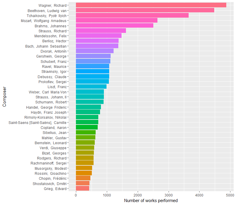
This is produced by running the following code.
tidy_nyp %>%
  filter(!composer %in% c('NULL', 'Traditional,', 'Anthem,')) %>%
  count(composer, sort=TRUE) %>%
  filter(n > 400) %>%
  mutate(composer = reorder(composer, n)) %>%
  ggplot(aes(composer, n, fill = composer)) +
  geom_bar(stat = 'identity') +
  xlab('Composer') +
  ylab('Number of works performed') +
  theme(legend.position="none") +
  coord_flip()
I was surprised to see Wagner on top, even ahead of Beethoven. Tchaikovsky was also a big surprise to me. He’s popular, but I’ve ushered or attended over 200 performances of the Chicago Symphony Orchestra, and Beethoven and Mozart are definitely performed more recently than Wagner and Tchaikovsky by the CSO today. So is this a NYP/CSO difference? Many of my music theory & history friends on Twitter were also surprised to see this ordering, so maybe not. In that case, have things changed over time?
Before looking at trends over time, let’s see if looking at specific works can shed any light. Here are the most performed works (and the code to produce the visualization), correcting for multiple movements listed from the same piece on the same program.
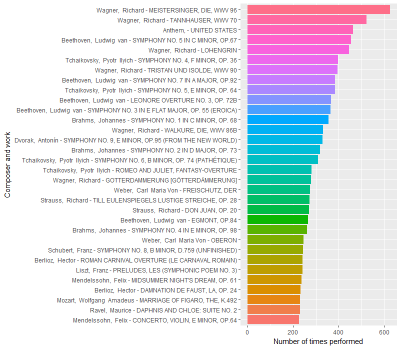
tidy_nyp %>%
  filter(!title %in% c('NULL')) %>%
  mutate(composer_work = paste(composer, '-', title)) %>%
  group_by(composer_work, programID) %>%
  summarize(times_on_program = n()) %>%
  count(composer_work, sort=TRUE) %>%
  filter(n > 220) %>%
  mutate(composer_work = reorder(composer_work, n)) %>%
  ggplot(aes(composer_work, n, fill = composer_work)) +
  geom_bar(stat = 'identity') +
  xlab('Composer and work') +
  ylab('Number of times performed') +
  theme(legend.position="none") +
  coord_flip()
There are a lot of Wagner operas at the top! (Though it’s worth noting that only a few instances of each are full performances. Instead, most are just the overture or prelude, a common way of opening out a symphony concert.) While many of Wagner’s most performed works are very short (10-minute overtures compared to 30-to-60-minute Beethoven and Tchaikovsky symphonies), and thus Beethoven probably occupies more time on the program than Wagner, the high number of Wagner, and even Tchaikovsky, pieces on NY Phil programs is still surprising to me.
Changes over time
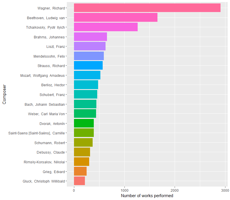
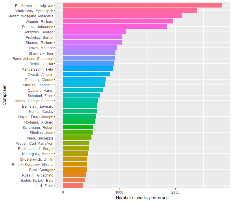
Let’s see how things have changed over time. We can start simply by comparing their early history to their late history. Here are composer counts from 1842 to 1929 and 1930 to 2016 (roughly equal timespans, though not equal numbers of pieces).
Pre-1930:
And post-1929:
To do this, I simply added another filter to tidy_nyp:
filter(as.integer(substr(as.character(date),1,4)) < 1930) %>%
Here we see Beethoven, Tchaikovsky, and Mozart all ahead of Wagner in more recent history, with Wagner dominating (and Mozart missing from) the earlier history.
But we can model this with more nuance. Let’s make a new tibble that contains just the information we need on composer frequency year-by-year.
comp_counts <- tidy_nyp %>%
  filter(!composer %in% c('NULL', 'Traditional,', 'Anthem,')) %>%
  mutate(year = as.integer(substr(as.character(date),1,4))) %>%
  group_by(year) %>%
  mutate(year_total = n()) %>%
  group_by(composer, year) %>%
  mutate(comp_total_by_year = n()) %>%
  ungroup() %>%
  group_by(composer, year, comp_total_by_year, year_total) %>%
  summarize() %>%
  mutate(share = comp_total_by_year/year_total) %>%
  group_by(year) %>%
  mutate(average_share = mean(share))
This produces a tibble that contains a record for each composer-year combination, with fields for:
- composer name
- year
- number of pieces by that composer in that year
- total number of pieces for the year
- composer’s share of pieces for the year
- average composer share for the year (total / number of composers)
With this information, we can then plot the changing frequency of each composer. Here are the top four on a single plot.
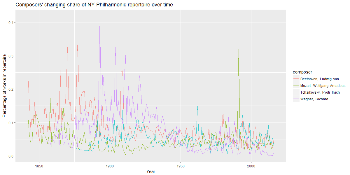
We can very clearly see the change in these composers’ frequency of occurrence on the NY Phil’s program over time, with Wagner’s decline very pronounced, and Mozart’s rise (in the twentieth century) clearly evident as well.
However, comparing a composer’s share of the programming year by year isn’t always apples-to-apples. Early on in the Philharmonic’s history, seasons contained far fewer pieces, and thus far fewer composers, than recent years. This has the potential to provide artificially high numbers for composers in sparser years, as seen in the following visualization (and accompanying code).
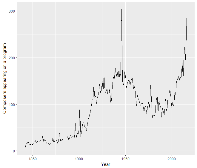
comp_counts %>%
  group_by(year) %>%
  summarize(comp_per_year = n()) %>%
  ggplot(aes(year, comp_per_year)) +
  geom_line() +
  xlab('Year') +
  ylab('Composers appearing on a program')
To account for this, we can normalize a composer’s share of the repertoire in a given year by dividing it by the average repertoire share for composers in the year. So here is the changing normalized frequency for each of the top four composers on a year-by-year basis.
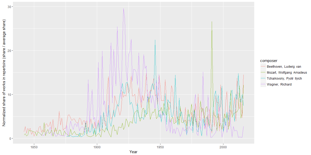
The same trends can be seen here ― Mozart’s gentle rise and Wagner’s drastic decline ― perhaps even more starkly. In particular, Wagner’s decline from a peak in 1921 to a trough in the 1960s stands out quite strikingly. The decline is the most precipitous in the late 1940s and early 1950s.
And now an explanation begins to emerge.
A number of musicians began to boycott or avoid performing the music of Richard Wagner in the late 1930s, as recounted by conductor Daniel Barenboim. Wagner was known as “Hitler’s favorite composer,” and his music was used prominently in the Reich. The Israel Philharmonic stopped performing his music in 1938, Arturo Toscanini (who occupies a not insignificant share of this dataset as a conductor) stopped performing at Wagner festivals in Bayreuth, etc. Looking at the NY Philharmonic data, it seems like this may be a broader trend.
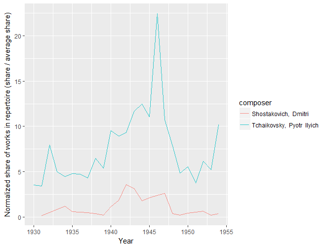
In addition to Wagner’s decline between WWI and the early Cold War, we can see another significant wartime change, this time an increase. From 1939 to 1946, Tchaikovsky’s share of the NY Philharmonic’s repertoire rose precipitously to his highest (normalized) share in the entire corpus. Could this be due to Russia’s role in the Grand Alliance? I don’t know. I do know that during World War II, then-living Russian composer Dmitri Shostakovich was widely performed in the US as part of a pro-Russia, anti-Nazi wartime propaganda effort (see below). Could Tchaikovsky have been part of that? I don’t know the history of it. But I wouldn’t be surprised. I also wouldn’t be surprised if Tchaikovsky simply filled the role of popular, grand, Romantic composer … who wasn’t German. (Any Tchaikovsky scholars have a perspective to add?)
Conclusion
This is just a start, but I think they’re interesting findings. As a music student and scholar, I never studied performance trends like this. My studies were mostly focused on musical structures and the evolution of compositional styles. But it’s cool to take a different kind of empirical look at musical evolution.
If this code helps you find other insights in the corpus, please drop me a line. I’m sure there’s much more to be mined out of this fascinating corpus.
And thanks to the archivists of the New York Philharmonic for putting this together! Hopefully more major orchestras will release their programming history publicly, so we can start mapping larger trends and make comparisons between them.
Banner image by Tim Hynes.